Leaving a lasting legacy on their city.
“We want to more accurately represent who we are as a church… a logo to fit who we are and where we’re going.”
Introduction
In late winter, a church in rural Georgia reached out to us to help them rebrand. Their church had a strong legacy in their community, but had let time get away from them and their visual identity no longer resonated with their church culture. They needed something new that didn’t feel foreign to their ethos.
DELIVERABLES
- Brand Strategy
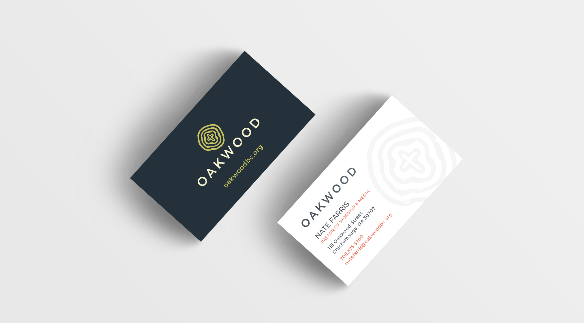
- Business Cards
- Visual Identity

The Results
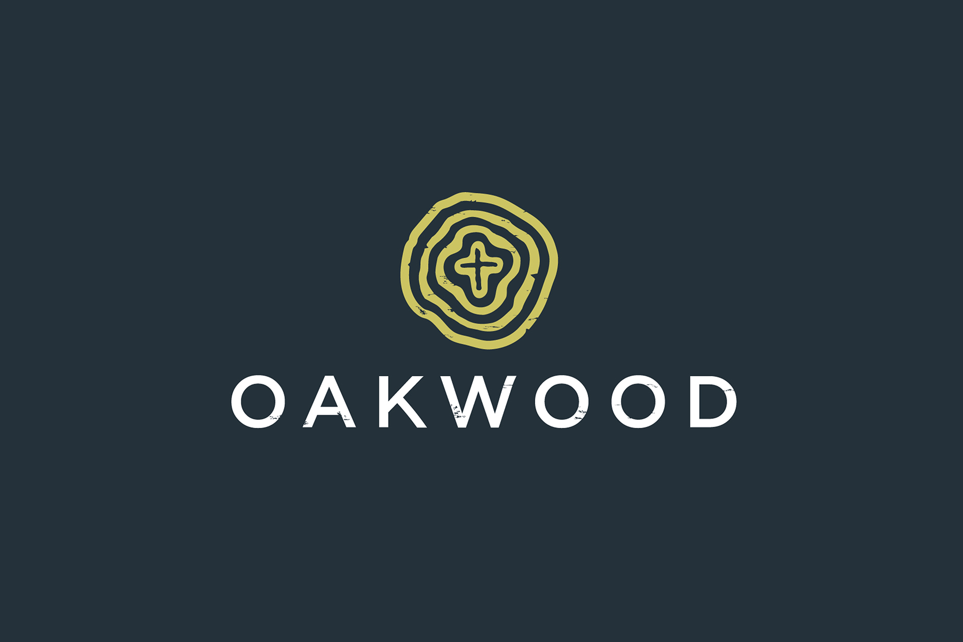
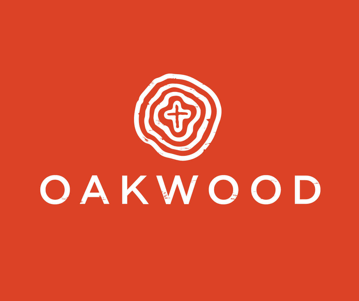
The final solution references the tree rings you might find in an old oak tree… Speaking to the legacy and long-time investment in their city. The typeface is modern and clean, but has a bit of grit to it, fitting a younger audience in rural Georgia.
Brand Colors
#24313a
#ccc463
#f7f4d0
#db4326
Typography
MONTSERRAT - A B C D E F G H I J K L M N O P Q R S T U V W X Y Z a b c d e f g h i j k l m n o p q r s t u v w x y z 1 2 3 4 5 6 7 8 9 0 ! @ # $ % ^ & * ( )